Housing Market Recovery in the Region
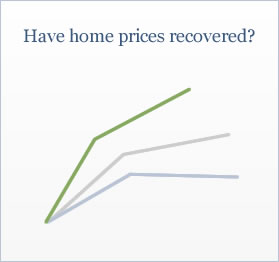
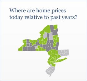
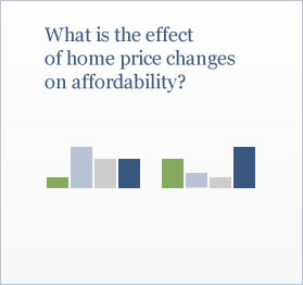
Where and to what extent are the housing markets of New York, New Jersey and Connecticut achieving a recovery? The following interactive visuals provide evidence of local conditions.
Loading...
For the U.S., home prices have increased on a year-over-year basis for most of 2012. As indicators of a national housing market recovery gain strength, is similar resilience manifesting for markets in New York, New Jersey, and Connecticut? We provide regional data that we anticipate will be valuable to policymakers, service providers and others, especially as they assess and undertake the process of recovering from Superstorm Sandy. The data show considerable variation across regional counties:
- In 35 percent of counties, mainly in upstate New York, median home prices reached the peak levels of 2006.
- 82 percent of counties have experienced a rise in home prices during 2012, possible evidence that local housing markets may have bottomed.
- Lower home prices may have increased home affordability across the region. For example, median households could afford the median home in 73 percent of the counties in 2012 as compared with 56 percent of counties in 2006.
Home Price Indexes
Home prices—both including and excluding distressed sales—are recovering at the national level. However, the extent of the recovery varies widely across local housing markets. The following chart compares home price indexes—normalized to the 2006 U.S. peak—for the geographies that you select.
Median home prices in 2012 relative to past years
A property’s location and year of purchase influence a homeowner’s equity position. This interactive map examines this connection by comparing county-level median home prices as of the third quarter of 2012 to previous years. For example, select a year on the timeline and a green color indicates that prices in that county in 2012 Q3 are higher than those in the selected year; similarly, counties with lower prices are colored dark grey.
- '00
- '01
- '02
- '03
- '04
- '05
- '06
- '07
- '08
- '09
- '10
- '11
- '12
Ratio of median household income to qualifying income
One way to assess home affordability is to compare a borrower’s actual income to the income required to qualify for a mortgage. Given a home’s price, lenders qualify homebuyers with incomes that result in debt-to-income (DTI) ratios—the percent of monthly gross income used to cover housing costs—between .25 and .35. The closer a homebuyer’s actual income is to the qualifying income, the more affordable housing is deemed to be. To illustrate this connection, we graph the ratio of median household income to qualifying income. Values above zero indicate higher affordability. For example, a ratio of 0.1 indicates that the median income is 10 percent higher than the qualifying income.
All home price data are from CoreLogic. The Home Price Index is based upon a repeat sales methodology and measures turnover of the existing housing stock. The data are reported to cover 80% of the nation’s active prime mortgages, 100% of the GSEs portfolios, over $500 billion in active subprime mortgages, and over 90% of the non-Agency mortgage and asset-backed securities market. To mitigate small-sample concerns, we use a 3-month moving average of the index.
Median household income data are from the U.S. Census Bureau’s Small Area Income and Poverty Estimates. Mortgage interest rates, fees and points are from Freddie Mac’s Primary Mortgage Market Survey.
Qualifying incomes are calculated based on the costs associated with the purchase of a median price home in any given geography. We assume a 20 percent down payment, 30-year fixed rate mortgage, and an allowance of 1.5 percent of the home value per year to account for tax and insurance payments.